What if a new version of Windows didn't try to dazzle you? What if, instead, it tried to disappear except when you needed it? Such an operating system would dispense with glitzy effects in favor of low-key, useful new features. Rather than pelting you with alerts, warnings, and requests, it would try to stay out of your face. And if any bundled applications weren't essential, it would dump 'em.
It's not a what-if scenario. Windows 7, set to arrive on new PCs and as a shrinkwrapped upgrade on October 22, has a minimalist feel and attempts to fix annoyances old and new. In contrast, Windows Vista offered a flashy new interface, but its poor performance, compatibility gotchas, and lack of compelling features made some folks regret upgrading and others refuse to leave Windows XP.
Windows 7 is hardly flawless. Some features feel unfinished; others won't realize their potential without heavy lifting by third parties. And some long-standing annoyances remain intact. But overall, the final shipping version I test-drove appears to be the worthy successor to Windows XP that Vista never was.
Microsoft's release of Windows 7 also roughly coincides with Apple's release of its new Snow Leopard; for a visual comparison of the two operating systems, see our slideshow "Snow Leopard Versus Windows 7." Of course, an OS can't be a winner if it turns a zippy PC into a slowpoke or causes installation nightmares. Consult "Windows 7 Performance Tests" for Windows 7 performance test results, and "How to Upgrade to Windows 7" for hands-on advice on the best way to install it. Read on here for an in-depth look at how Microsoft has changed its OS--mostly for the better--in Windows 7.

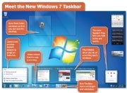 Windows 7's revamped Taskbar introduces several new features and gives users much more control over how it looks.The new Taskbar replaces the old small icons and text labels for running apps with larger, unlabeled icons. If you can keep the icons straight, the new design painlessly reduces Taskbar clutter. If you don't like it, you can shrink the icons and/or bring the labels back.
In the past, you could get one-click access to programs by dragging their icons to the Quick Launch toolbar. Windows 7 eliminates Quick Launch and folds its capabilities into the Taskbar. Drag an app's icon from the Start menu or desktop to the Taskbar, and Windows will pin it there, so you can launch the program without rummaging around in the Start menu. You can also organize icons in the Taskbar by moving them to new positions.
To indicate that a particular application on the Taskbar is running, Windows draws a subtle box around its icon--so subtle, in fact, that figuring out whether the app is running can take a moment, especially if its icon sits between two icons for running apps.
In Windows Vista, hovering the mouse pointer over an application's Taskbar icon produces a thumbnail window view known as a Live Preview. But when you have multiple windows open, you see only one preview at a time. Windows 7's version of this feature is slicker and more efficient: Hover the pointer on an icon, and thumbnails of the app's windows glide into position above the Taskbar, so you can quickly find the one you're looking for. (The process would be even simpler if the thumbnails were larger and easier to decipher.)
Also new in Windows 7's Taskbar is a feature called Jump Lists. These menus resemble the context-sensitive ones you get when you right-click within various Windows applications, except that you don't have to be inside an app to use them. Internet Explorer 8's Jump List, for example, lets you open the browser and load a fresh tab, initiate an InPrivate stealth browsing session, or go directly to any of eight frequently visited Web pages. Non-Microsoft apps can offer Jump Lists, too, if their developers follow the guidelines for creating them.
Other Windows 7 interface adjustments are minor, yet so sensible that you may wonder why Windows didn't include them all along. Shove a window into the left or right edge of the screen and it'll expand to fill half of your desktop. Nudge another into the opposite edge of the screen, and it'll expand to occupy the other half. That makes comparing two windows' contents easy. If you nudge a window into the top of the screen, it will maximize to occupy all of the display's real estate.
The extreme right edge of the Taskbar now sports a sort of nub; hover over it, and open windows become transparent, revealing the desktop below. (Microsoft calls this feature Aero Peek.) Click the nub, and the windows scoot out of the way, giving you access to documents or apps that reside on the desktop and duplicating the Show Desktop feature that Quick Launch used to offer.
Getting at your desktop may soon become even more important than it was in the past. That's because Windows 7 does away with the Sidebar, the portion of screen space that Windows Vista reserved for Gadgets such as a photo viewer and a weather applet. Instead of occupying the Sidebar, Gadgets now sit directly on the desktop, where they don't compete with other apps for precious screen real estate.
Old Tray, New Tricks: Windows 7's Taskbar and window management tweaks are nice. But its changes to the System Tray--aka the Notification Area--have a huge positive effect.

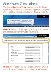 Changes in Windows 7 transform the System Tray from an intrusive eyesore (in Windows Vista) into a useful set of shortcuts and other controls.In the past, no feature of Windows packed more frustration per square inch than the System Tray. It quickly grew dense with applets that users did not want in the first place, and many of the uninvited guests employed word balloons and other intrusive methods to alert users to uninteresting facts at inopportune moments. At their worst, System Tray applets behaved like belligerent squatters, and Windows did little to put users back in charge.
In Windows 7, applets can't pester you unbidden because software installers can't dump them into the System Tray. Instead, applets land in a holding pen that appears only when you click it, a much-improved version of the overflow area used in previous incarnations of the Tray. Applets in the pen can't float word balloons at you unless you permit them to do so. It's a cinch to drag them into the System Tray or out of it again, so you enjoy complete control over which applets reside there.
More good news: Windows 7 largely dispenses with the onslaught of word-balloon warnings from the OS about troubleshooting issues, potential security problems, and the like. A new area called Action Center--a revamped version of Vista's Security Center--queues up such alerts so you can deal with them at your convenience. Action Center does issue notifications of its own from the System Tray, but you can shut these off if you don't want them pestering you.
All of this helps make Windows 7 the least distracting, least intrusive Microsoft OS in a very long time. It's a giant step forward from the days when Windows thought nothing of interrupting your work to inform you that it had detected unused icons on your desktop.
Libraries could just as appropriately have been called File Cabinets, since they let you collect related folders in one place. By default, you get Libraries labeled Documents, Music, Pictures, and Videos, each of which initially directs you to the OS's standard folders for storing the named items--such as My Pictures and Public Pictures.
To benefit from Libraries, you have to customize them. Right-click any folder on your hard drive, and you can add it to any Library; for instance, you can transform the Pictures Library into a collection of all your folders that contain photos. You can create additional Libraries of your own from scratch, such as one that bundles up all folders that relate to your vacation plans.
Libraries would be even more useful if Microsoft had integrated them with Saved Searches, the Windows feature (introduced in Vista) that lets you create virtual folders based on searches, such as one that tracks down every .jpg image file on your system. But while Windows 7 lets you add standard folders to a Library, it doesn't support Saved Searches.
HomeGroups, Swee HomeGroups? Closely related to Libraries are HomeGroups, a new feature designed to simplify the notoriously tricky process of networking Windows PCs. Machines that are part of one HomeGroup can selectively grant each other read or read/write access to their Libraries and to the folders they contain, so you can perform such mundane but important tasks as providing your spouse with access to a folderful of tax documents on your computer. HomeGroups can also stream media, enabling you to pipe music or a movie off the desktop in the den onto your notebook in the living room. And they let you share a printer connected to one PC with all the other computers in the HomeGroup, a useful feature if you can't connect the printer directly to the network.
HomeGroups aren't a bad idea, but Windows 7's implementation seems half-baked. HomeGroups are password-protected, but rather than inviting you to specify a password of your choice during initial setup, Windows assigns you one consisting of ten characters of alphanumeric gibberish and instructs you to write it down so you won't forget it. To be fair, passwords made up of random characters provide excellent security, and the only time you need the password is when you first connect a new PC to a HomeGroup. But it's still a tad peculiar that you can't specify a password you'll remember during setup--you can do that only after the fact, in a different part of the OS. More annoying and limiting: HomeGroups won't work unless all of the PCs in question are running Windows 7, a scenario that won't be typical anytime soon. A version that also worked on XP, Vista, and Mac systems would have been cooler.
Federated Search, a new Windows Explorer feature, feels incomplete, too. It uses the OpenSearch standard to give Win 7's search "connectors" for external sources. That capability allows you to search sites such as Flickr and YouTube from within Explorer. Pretty neat--except that Windows 7 doesn't come with any of the connectors you'd need to add these sources, nor with any way of finding them. (They are available on the Web, though. Use a search engine to track them down.)

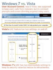 Whereas Vista's notorious User Account Control gave users no control over the feature other than to turn it off, Windows 7's version of UAC lets users choose from two intermediate notification levels between 'Always notify' and 'Never notify'.Windows 7 gives you control over UAC, in the form of a slider containing four security settings. As before, you can accept the full-blown UAC or elect to disable it. But you can also tell UAC to notify you only when software changes Windows settings, not when you're tweaking them yourself. And you can instruct it not to perform the abrupt screen-dimming effect that Vista's version uses to grab your attention.
If Microsoft had its druthers, all Windows 7 users would use UAC in full-tilt mode: The slider that you use to ratchet back its severity advises you not to do so if you routinely install new software or visit unfamiliar sites, and it warns that disabling the dimming effect is "Not recommended." Speak for yourself, Redmond: I have every intention of recommending the intermediate settings to most people who ask me for advice, since those settings retain most of UAC's theoretical value without driving users bonkers.
Other than salvaging UAC, Microsoft has made relatively few significant changes to Windows 7's security system. One meaningful improvement: BitLocker, the drive-encryption tool included only in Windows 7 Ultimate and the corporate-oriented Windows 7 Enterprise, lets you encrypt USB drives and hard disks, courtesy of a feature called BitLocker to Go. It's one of the few good reasons to prefer Win 7 Ultimate to Home Premium or Professional.
Internet Explorer 8, Windows 7's default browser, includes many security-related enhancements, including a new SmartScreen Filter (which blocks dangerous Web sites) and InPrivate Browsing (which permits you to use IE without leaving traces of where you've been or what you've done). Of course, IE 8 is equally at home in XP and Vista--and it's free--so it doesn't constitute a reason to upgrade to Windows 7.
Users who don't want to give them up can find all three at live.windows.com as free Windows Live Essentials downloads. They may even come with your new PC, courtesy of deals Microsoft is striking with PC manufacturers. But since they are no longer tied to the leisurely release schedules of Windows, they are far less likely than most bundled Windows apps to remain mired indefinitely in an underachieving state.
Still present--and nicely spruced up--are the operating system's two applications for consuming audio and video, Windows Media Player and Windows Media Center. Windows Media Player 12 has a revised interface that divides operations into a Library view for media management and a Now Playing view for listening and watching stuff. Minimize the player into the Taskbar, and you get miniplayer controls and a Jump List, both of which let you control background music without having to leave the app you're in. Microsoft has added support for several media types that Media Player 11 didn't support, including AAC audio and H.264 video--the formats it needs to play unprotected music and movies from Apple's iTunes Store.
Media Center--not part of the bargain-basement Windows 7 Starter Edition--remains most useful if you have a PC configured with a TV tuner card and you use your computer to record TV shows à la TiVo. Among its enhancements are a better program guide and support for more tuners.

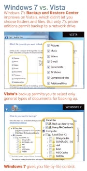 The Backup and Restore Center in Windows 7 gives users greater specificity in selecting files to back up than Vista did, but most versions of Win 7 can't back up to a network drive.Windows Vista's oddly underpowered Backup and Restore Center let users specify particular types of files to back up (such as ‘Music' and ‘Documents') but not specific files or folders. Though Microsoft corrects that deficiency in Windows 7, it deprives Windows 7 Starter Edition and Home Premium of the ability to back up to a network drive. That feels chintzy, like a car company cutting back on an economy sedan's airbags. It also continues the company's long streak of issuing versions of Windows that lack a truly satisfying backup utility.
The new version of Paint has Office 2007's Ribbon toolbar and adds various prefabricated geometric shapes and a few natural-media tools, such as a watercolor brush. But my regimen for preparing a new Windows PC for use will still include installing the impressive free image editor Paint.Net.
The nearest thing Windows 7 has to a major new application has the intriguing moniker Windows XP Mode. It's not a way to make Windows 7 look like XP--you can do that with the Windows Classic theme--but rather a way to let it run XP programs that are otherwise incompatible with Win 7. Unfortunately, only Windows 7 Professional, Enterprise, and Ultimate offer it, and even then it comes as an optional 350MB download that requires you to have Microsoft's free Virtual PC software installed and that only works on PCs with Intel or AMD virtualization technology enabled in the BIOS.
Once active, XP Mode lets Windows 7 run apps that supposedly aren't compatible by launching them in separate windows that contain a virtualized version of XP. Microsoft clearly means for the mode to serve as a security blanket for business types who rely on ancient, often proprietary programs that may never be rewritten for current OSs.
More important, the OS introduces Device Stages--hardware-wrangling dashboards tailored to specific items of hardware, and designed by their manufacturers in collaboration with Microsoft. A Device Stage for a digital camera, for instance, may include a battery gauge, a shortcut to Windows' image-downloading tools, and links to online resources such as manuals, support sites, and the manufacturer's accessory store.
You don't need to rummage through the Control Panel or through Devices and Printers to use a Device Stage--that feature's functionality is integrated into Windows 7's new Taskbar. Plug in a device, and it will show up as a Taskbar icon; right-click that icon, and the Device Stage's content will at once appear as a Jump List-like menu.
Unfortunately, Device Stages were the one major part of Windows 7 that didn't work during my hands-on time with the final version of the OS. Earlier prerelease versions of Win 7 contained a handful of Device Stages, but Microsoft disabled them so that hardware manufacturers could finish up final ones before the OS hit store shelves in October. The feature will be a welcome improvement if device manufacturers hop on the bandwagon--and a major disappointment if they don't.
Even if Device Stages take off, most of their benefit may come as you invest in new gizmos--Microsoft says that it's encouraging manufacturers to create Device Stages for upcoming products, not existing ones. At least some older products should get Device Stages, though: Canon, for instance, told me that it's planning to build them for most of its printers. And Microsoft says that when no full-fledged Device Stage is available for a particular item, Windows 7 will still try to give you a more generic and basic one.

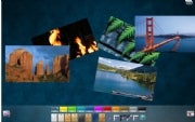 Microsoft’s Collage tool shows off the power of touch-based input to good effect.The biggest user interface trend since Windows Vista shipped in January 2007 is touchscreen input; Windows 7 is the first version of the OS to offer built-in multitouch support (see "Windows 7 Hardware: Touch Finally Arrives").
Windows 7's new touch features are subtle on a touch-capable PC and invisible otherwise. Swipe your finger up or down to scroll through document files and Web pages; sweep two fingers back and forth to zoom in and out. Dragging up on icons in the Taskbar reveals Win 7's new Jump Lists. The Taskbar button that reveals the Windows desktop is a bit bigger on touch PCs for easier use.
I installed the final version of Windows 7 and beta touchscreen drivers on an HP TouchSmart all-in-one PC. The touch features worked as advertised. But applications written with touch as the primary interface will determine whether touch becomes useful and ubiquitous. Until they arrive, Windows will continue to feel like an OS built chiefly for use with a keyboard and mouse--which it is.
You might have expected Microsoft to reinvent familiar tools such as Paint and Media Player for touch input. But the closest it comes to that is with the Windows 7 Touch Pack, a set of six touch-based programs, including a version of Virtual Earth that you can explore with your finger, and an app that lets you assemble photo collages. The Touch Pack isn't part of Windows 7, but it will ship with some Win 7 PCs, and it's a blast to play with.
Still, ultimately, the Pack is just a sexy demo of the interface's potential, not an argument for buying a touch computer today. Third-party software developers won't start writing touch-centric apps in force until a critical mass of PCs can run them. That should happen in the months following Windows 7's release, as finger-ready machines from Asus, Lenovo, Sony, and other manufacturers join those from HP and Dell. And even then, touch input may not become commonplace on Windows 7 PCs. But if a killer touch app is out there waiting to be written, we may know soon enough.
Over the past ten months, I've spent a substantial percentage of my computing life in Windows 7, starting with a preliminary version and culminating in recent weeks with the final Release to Manufacturing edition. I've run it on systems ranging from an underpowered Asus EeePC 1000HE netbook to a potent HP TouchSmart all-in-one. And I've used it to do real work, not lab routines.
Usually, I've run the OS in multiboot configurations with Windows Vista and/or XP, so I've had a choice each time I turned the computer on: Should I opt for Windows 7 or an older version of the OS? The call has been easy to make, because Win 7 is so pleasant to use.
So why wouldn't you want to run this operating system? Concern over its performance is one logical reason, especially since early versions of Windows Vista managed to turn PCs that ran XP with ease into lethargic underperformers. The PC World Test Center's speed benchmarks on five test PCs showed Windows 7 to be faster than Vista, but only by a little; I've found it to be reasonably quick on every computer I've used it on--even the Asus netbook, once I upgraded it to 2GB of RAM. (Our lab tried Win 7 on a Lenovo S10 netbook with 1GB of RAM and found it to be a shade slower than XP; for details see "Windows 7 Performance Tests.")
Here's a rule of thumb that errs on the side of caution: If your PC's specs qualify it to run Vista, get Windows 7; if they aren't, avoid it. Microsoft's official hardware configuration requirements for Windows 7 are nearly identical to those it recommends for Windows Vista: a 1-GHz CPU, 1GB of RAM, 16GB of free disk space, and a DirectX 9-compatible graphics device with a WDDM 1.0 or higher driver. That's for the 32-bit version of Windows 7; the 64-bit version of the OS requires a 64-bit CPU, 2GB of RAM, and 20GB of disk space.
Fear of incompatible hardware and software is another understandable reason to be wary of Windows 7. One unfortunate law of operating-system upgrades--which applies equally to Macs and to Windows PCs--is that they will break some systems and applications, especially at first.
Under the hood, Windows 7 isn't radically different from Vista. That's a plus, since it should greatly reduce the volume of difficulties relating to drivers and apps compared to Vista's bumpy rollout. I have performed a half-dozen Windows 7 upgrades, and most of them went off without a hitch. The gnarliest problem arose when I had to track down a graphics driver for Dell's XPS M1330 laptop on my own--Windows 7 installed a generic VGA driver that couldn't run the Aero user interface, and as a result failed to support new Windows 7 features such as thumbnail views in the Taskbar.
The best way to reduce your odds of running into a showstopping problem with Windows 7 is to bide your time. When the new operating system arrives on October 22, sit back and let the earliest adopters discover the worst snafus. Within a few weeks, Microsoft and other software and hardware companies will have fixed most of them, and your chances of a happy migration to Win 7 will be much higher. If you want to be really conservative, hold off on moving to Win 7 until you're ready to buy a PC that's designed to run it well.
Waiting a bit before making the leap makes sense; waiting forever does not. Microsoft took far too long to come up with a satisfactory replacement for Windows XP. But whether you choose to install Windows 7 on your current systems or get it on the next new PC you buy, you'll find that it's the unassuming, thoroughly practical upgrade you've been waiting for--flaws and all.
F
It's not a what-if scenario. Windows 7, set to arrive on new PCs and as a shrinkwrapped upgrade on October 22, has a minimalist feel and attempts to fix annoyances old and new. In contrast, Windows Vista offered a flashy new interface, but its poor performance, compatibility gotchas, and lack of compelling features made some folks regret upgrading and others refuse to leave Windows XP.
Windows 7 is hardly flawless. Some features feel unfinished; others won't realize their potential without heavy lifting by third parties. And some long-standing annoyances remain intact. But overall, the final shipping version I test-drove appears to be the worthy successor to Windows XP that Vista never was.
Microsoft's release of Windows 7 also roughly coincides with Apple's release of its new Snow Leopard; for a visual comparison of the two operating systems, see our slideshow "Snow Leopard Versus Windows 7." Of course, an OS can't be a winner if it turns a zippy PC into a slowpoke or causes installation nightmares. Consult "Windows 7 Performance Tests" for Windows 7 performance test results, and "How to Upgrade to Windows 7" for hands-on advice on the best way to install it. Read on here for an in-depth look at how Microsoft has changed its OS--mostly for the better--in Windows 7.
Interface: The New Taskmaster
The Windows experience occurs mainly in its Taskbar--especially in the Start menu and System Tray. Vista gave the Start menu a welcome redesign; in Windows 7, the Taskbar and the System Tray get a thorough makeover. Windows 7's revamped Taskbar introduces several new features and gives users much more control over how it looks.The new Taskbar replaces the old small icons and text labels for running apps with larger, unlabeled icons. If you can keep the icons straight, the new design painlessly reduces Taskbar clutter. If you don't like it, you can shrink the icons and/or bring the labels back.
In the past, you could get one-click access to programs by dragging their icons to the Quick Launch toolbar. Windows 7 eliminates Quick Launch and folds its capabilities into the Taskbar. Drag an app's icon from the Start menu or desktop to the Taskbar, and Windows will pin it there, so you can launch the program without rummaging around in the Start menu. You can also organize icons in the Taskbar by moving them to new positions.
To indicate that a particular application on the Taskbar is running, Windows draws a subtle box around its icon--so subtle, in fact, that figuring out whether the app is running can take a moment, especially if its icon sits between two icons for running apps.
In Windows Vista, hovering the mouse pointer over an application's Taskbar icon produces a thumbnail window view known as a Live Preview. But when you have multiple windows open, you see only one preview at a time. Windows 7's version of this feature is slicker and more efficient: Hover the pointer on an icon, and thumbnails of the app's windows glide into position above the Taskbar, so you can quickly find the one you're looking for. (The process would be even simpler if the thumbnails were larger and easier to decipher.)
Also new in Windows 7's Taskbar is a feature called Jump Lists. These menus resemble the context-sensitive ones you get when you right-click within various Windows applications, except that you don't have to be inside an app to use them. Internet Explorer 8's Jump List, for example, lets you open the browser and load a fresh tab, initiate an InPrivate stealth browsing session, or go directly to any of eight frequently visited Web pages. Non-Microsoft apps can offer Jump Lists, too, if their developers follow the guidelines for creating them.
Other Windows 7 interface adjustments are minor, yet so sensible that you may wonder why Windows didn't include them all along. Shove a window into the left or right edge of the screen and it'll expand to fill half of your desktop. Nudge another into the opposite edge of the screen, and it'll expand to occupy the other half. That makes comparing two windows' contents easy. If you nudge a window into the top of the screen, it will maximize to occupy all of the display's real estate.
The extreme right edge of the Taskbar now sports a sort of nub; hover over it, and open windows become transparent, revealing the desktop below. (Microsoft calls this feature Aero Peek.) Click the nub, and the windows scoot out of the way, giving you access to documents or apps that reside on the desktop and duplicating the Show Desktop feature that Quick Launch used to offer.
Getting at your desktop may soon become even more important than it was in the past. That's because Windows 7 does away with the Sidebar, the portion of screen space that Windows Vista reserved for Gadgets such as a photo viewer and a weather applet. Instead of occupying the Sidebar, Gadgets now sit directly on the desktop, where they don't compete with other apps for precious screen real estate.
Old Tray, New Tricks: Windows 7's Taskbar and window management tweaks are nice. But its changes to the System Tray--aka the Notification Area--have a huge positive effect.
 Changes in Windows 7 transform the System Tray from an intrusive eyesore (in Windows Vista) into a useful set of shortcuts and other controls.In the past, no feature of Windows packed more frustration per square inch than the System Tray. It quickly grew dense with applets that users did not want in the first place, and many of the uninvited guests employed word balloons and other intrusive methods to alert users to uninteresting facts at inopportune moments. At their worst, System Tray applets behaved like belligerent squatters, and Windows did little to put users back in charge.
In Windows 7, applets can't pester you unbidden because software installers can't dump them into the System Tray. Instead, applets land in a holding pen that appears only when you click it, a much-improved version of the overflow area used in previous incarnations of the Tray. Applets in the pen can't float word balloons at you unless you permit them to do so. It's a cinch to drag them into the System Tray or out of it again, so you enjoy complete control over which applets reside there.
More good news: Windows 7 largely dispenses with the onslaught of word-balloon warnings from the OS about troubleshooting issues, potential security problems, and the like. A new area called Action Center--a revamped version of Vista's Security Center--queues up such alerts so you can deal with them at your convenience. Action Center does issue notifications of its own from the System Tray, but you can shut these off if you don't want them pestering you.
All of this helps make Windows 7 the least distracting, least intrusive Microsoft OS in a very long time. It's a giant step forward from the days when Windows thought nothing of interrupting your work to inform you that it had detected unused icons on your desktop.
File Management: The Library System
Compared to the Taskbar and the System Tray, Explorer hasn't changed much in Windows 7. However, its left pane does sport two new ways to get at your files: Libraries and HomeGroups.Libraries could just as appropriately have been called File Cabinets, since they let you collect related folders in one place. By default, you get Libraries labeled Documents, Music, Pictures, and Videos, each of which initially directs you to the OS's standard folders for storing the named items--such as My Pictures and Public Pictures.
To benefit from Libraries, you have to customize them. Right-click any folder on your hard drive, and you can add it to any Library; for instance, you can transform the Pictures Library into a collection of all your folders that contain photos. You can create additional Libraries of your own from scratch, such as one that bundles up all folders that relate to your vacation plans.
Libraries would be even more useful if Microsoft had integrated them with Saved Searches, the Windows feature (introduced in Vista) that lets you create virtual folders based on searches, such as one that tracks down every .jpg image file on your system. But while Windows 7 lets you add standard folders to a Library, it doesn't support Saved Searches.
HomeGroups, Swee HomeGroups? Closely related to Libraries are HomeGroups, a new feature designed to simplify the notoriously tricky process of networking Windows PCs. Machines that are part of one HomeGroup can selectively grant each other read or read/write access to their Libraries and to the folders they contain, so you can perform such mundane but important tasks as providing your spouse with access to a folderful of tax documents on your computer. HomeGroups can also stream media, enabling you to pipe music or a movie off the desktop in the den onto your notebook in the living room. And they let you share a printer connected to one PC with all the other computers in the HomeGroup, a useful feature if you can't connect the printer directly to the network.
HomeGroups aren't a bad idea, but Windows 7's implementation seems half-baked. HomeGroups are password-protected, but rather than inviting you to specify a password of your choice during initial setup, Windows assigns you one consisting of ten characters of alphanumeric gibberish and instructs you to write it down so you won't forget it. To be fair, passwords made up of random characters provide excellent security, and the only time you need the password is when you first connect a new PC to a HomeGroup. But it's still a tad peculiar that you can't specify a password you'll remember during setup--you can do that only after the fact, in a different part of the OS. More annoying and limiting: HomeGroups won't work unless all of the PCs in question are running Windows 7, a scenario that won't be typical anytime soon. A version that also worked on XP, Vista, and Mac systems would have been cooler.
Federated Search, a new Windows Explorer feature, feels incomplete, too. It uses the OpenSearch standard to give Win 7's search "connectors" for external sources. That capability allows you to search sites such as Flickr and YouTube from within Explorer. Pretty neat--except that Windows 7 doesn't come with any of the connectors you'd need to add these sources, nor with any way of finding them. (They are available on the Web, though. Use a search engine to track them down.)
Security: UAC Gets Tolerable
Speaking of annoying Windows features, let's talk about User Account Control--the Windows Vista security element that was a poster child for everything that rankled people about that OS. UAC aimed to prevent rogue software from tampering with your PC by endlessly prompting you to approve running applications or changing settings. The experience was so grating that many users preferred to turn UAC off and take their chances with Internet attackers. Those who left it active risked slipping into the habit of incautiously clicking through every prompt, defeating whatever value the feature might have had. Whereas Vista's notorious User Account Control gave users no control over the feature other than to turn it off, Windows 7's version of UAC lets users choose from two intermediate notification levels between 'Always notify' and 'Never notify'.Windows 7 gives you control over UAC, in the form of a slider containing four security settings. As before, you can accept the full-blown UAC or elect to disable it. But you can also tell UAC to notify you only when software changes Windows settings, not when you're tweaking them yourself. And you can instruct it not to perform the abrupt screen-dimming effect that Vista's version uses to grab your attention.
If Microsoft had its druthers, all Windows 7 users would use UAC in full-tilt mode: The slider that you use to ratchet back its severity advises you not to do so if you routinely install new software or visit unfamiliar sites, and it warns that disabling the dimming effect is "Not recommended." Speak for yourself, Redmond: I have every intention of recommending the intermediate settings to most people who ask me for advice, since those settings retain most of UAC's theoretical value without driving users bonkers.
Other than salvaging UAC, Microsoft has made relatively few significant changes to Windows 7's security system. One meaningful improvement: BitLocker, the drive-encryption tool included only in Windows 7 Ultimate and the corporate-oriented Windows 7 Enterprise, lets you encrypt USB drives and hard disks, courtesy of a feature called BitLocker to Go. It's one of the few good reasons to prefer Win 7 Ultimate to Home Premium or Professional.
Internet Explorer 8, Windows 7's default browser, includes many security-related enhancements, including a new SmartScreen Filter (which blocks dangerous Web sites) and InPrivate Browsing (which permits you to use IE without leaving traces of where you've been or what you've done). Of course, IE 8 is equally at home in XP and Vista--and it's free--so it doesn't constitute a reason to upgrade to Windows 7.
Applications: The Fewer the Merrier
Here's a startling indication of how different an upgrade Windows 7 is: Rather than larding it up with new applications, Microsoft eliminated three nonessential programs: Windows Mail (née Outlook Express), Windows Movie Maker (which premiered in Windows Me), and Windows Photo Gallery.Users who don't want to give them up can find all three at live.windows.com as free Windows Live Essentials downloads. They may even come with your new PC, courtesy of deals Microsoft is striking with PC manufacturers. But since they are no longer tied to the leisurely release schedules of Windows, they are far less likely than most bundled Windows apps to remain mired indefinitely in an underachieving state.
Still present--and nicely spruced up--are the operating system's two applications for consuming audio and video, Windows Media Player and Windows Media Center. Windows Media Player 12 has a revised interface that divides operations into a Library view for media management and a Now Playing view for listening and watching stuff. Minimize the player into the Taskbar, and you get miniplayer controls and a Jump List, both of which let you control background music without having to leave the app you're in. Microsoft has added support for several media types that Media Player 11 didn't support, including AAC audio and H.264 video--the formats it needs to play unprotected music and movies from Apple's iTunes Store.
Media Center--not part of the bargain-basement Windows 7 Starter Edition--remains most useful if you have a PC configured with a TV tuner card and you use your computer to record TV shows à la TiVo. Among its enhancements are a better program guide and support for more tuners.
 The Backup and Restore Center in Windows 7 gives users greater specificity in selecting files to back up than Vista did, but most versions of Win 7 can't back up to a network drive.Windows Vista's oddly underpowered Backup and Restore Center let users specify particular types of files to back up (such as ‘Music' and ‘Documents') but not specific files or folders. Though Microsoft corrects that deficiency in Windows 7, it deprives Windows 7 Starter Edition and Home Premium of the ability to back up to a network drive. That feels chintzy, like a car company cutting back on an economy sedan's airbags. It also continues the company's long streak of issuing versions of Windows that lack a truly satisfying backup utility.
The new version of Paint has Office 2007's Ribbon toolbar and adds various prefabricated geometric shapes and a few natural-media tools, such as a watercolor brush. But my regimen for preparing a new Windows PC for use will still include installing the impressive free image editor Paint.Net.
The nearest thing Windows 7 has to a major new application has the intriguing moniker Windows XP Mode. It's not a way to make Windows 7 look like XP--you can do that with the Windows Classic theme--but rather a way to let it run XP programs that are otherwise incompatible with Win 7. Unfortunately, only Windows 7 Professional, Enterprise, and Ultimate offer it, and even then it comes as an optional 350MB download that requires you to have Microsoft's free Virtual PC software installed and that only works on PCs with Intel or AMD virtualization technology enabled in the BIOS.
Once active, XP Mode lets Windows 7 run apps that supposedly aren't compatible by launching them in separate windows that contain a virtualized version of XP. Microsoft clearly means for the mode to serve as a security blanket for business types who rely on ancient, often proprietary programs that may never be rewritten for current OSs.
Device Management: Setting the Stage
Windows 7 offers you numerous ways to connect your PC to everything from tiny flash drives to hulking networked laser printers--USB, Wi-Fi, ethernet, slots, and more. Devices and Printers, a new section of the Control Panel, represents connected gadgets with the largest icons I've ever seen in an operating system. (When possible, they're 3D renderings of the device; the one for Sansa's Clip MP3 player is almost life-size.)More important, the OS introduces Device Stages--hardware-wrangling dashboards tailored to specific items of hardware, and designed by their manufacturers in collaboration with Microsoft. A Device Stage for a digital camera, for instance, may include a battery gauge, a shortcut to Windows' image-downloading tools, and links to online resources such as manuals, support sites, and the manufacturer's accessory store.
You don't need to rummage through the Control Panel or through Devices and Printers to use a Device Stage--that feature's functionality is integrated into Windows 7's new Taskbar. Plug in a device, and it will show up as a Taskbar icon; right-click that icon, and the Device Stage's content will at once appear as a Jump List-like menu.
Unfortunately, Device Stages were the one major part of Windows 7 that didn't work during my hands-on time with the final version of the OS. Earlier prerelease versions of Win 7 contained a handful of Device Stages, but Microsoft disabled them so that hardware manufacturers could finish up final ones before the OS hit store shelves in October. The feature will be a welcome improvement if device manufacturers hop on the bandwagon--and a major disappointment if they don't.
Even if Device Stages take off, most of their benefit may come as you invest in new gizmos--Microsoft says that it's encouraging manufacturers to create Device Stages for upcoming products, not existing ones. At least some older products should get Device Stages, though: Canon, for instance, told me that it's planning to build them for most of its printers. And Microsoft says that when no full-fledged Device Stage is available for a particular item, Windows 7 will still try to give you a more generic and basic one.
Input: Reach Out and Touch Windows 7
 Microsoft’s Collage tool shows off the power of touch-based input to good effect.The biggest user interface trend since Windows Vista shipped in January 2007 is touchscreen input; Windows 7 is the first version of the OS to offer built-in multitouch support (see "Windows 7 Hardware: Touch Finally Arrives").
Windows 7's new touch features are subtle on a touch-capable PC and invisible otherwise. Swipe your finger up or down to scroll through document files and Web pages; sweep two fingers back and forth to zoom in and out. Dragging up on icons in the Taskbar reveals Win 7's new Jump Lists. The Taskbar button that reveals the Windows desktop is a bit bigger on touch PCs for easier use.
I installed the final version of Windows 7 and beta touchscreen drivers on an HP TouchSmart all-in-one PC. The touch features worked as advertised. But applications written with touch as the primary interface will determine whether touch becomes useful and ubiquitous. Until they arrive, Windows will continue to feel like an OS built chiefly for use with a keyboard and mouse--which it is.
You might have expected Microsoft to reinvent familiar tools such as Paint and Media Player for touch input. But the closest it comes to that is with the Windows 7 Touch Pack, a set of six touch-based programs, including a version of Virtual Earth that you can explore with your finger, and an app that lets you assemble photo collages. The Touch Pack isn't part of Windows 7, but it will ship with some Win 7 PCs, and it's a blast to play with.
Still, ultimately, the Pack is just a sexy demo of the interface's potential, not an argument for buying a touch computer today. Third-party software developers won't start writing touch-centric apps in force until a critical mass of PCs can run them. That should happen in the months following Windows 7's release, as finger-ready machines from Asus, Lenovo, Sony, and other manufacturers join those from HP and Dell. And even then, touch input may not become commonplace on Windows 7 PCs. But if a killer touch app is out there waiting to be written, we may know soon enough.
Bottom Line: Is Windows 7 Worth It?
Reading about a new operating system can tell you only so much about it: After all, Windows Vista had far more features than XP, yet fell far short of it in the eyes of many users. To judge an OS accurately, you have to live with it.Over the past ten months, I've spent a substantial percentage of my computing life in Windows 7, starting with a preliminary version and culminating in recent weeks with the final Release to Manufacturing edition. I've run it on systems ranging from an underpowered Asus EeePC 1000HE netbook to a potent HP TouchSmart all-in-one. And I've used it to do real work, not lab routines.
Usually, I've run the OS in multiboot configurations with Windows Vista and/or XP, so I've had a choice each time I turned the computer on: Should I opt for Windows 7 or an older version of the OS? The call has been easy to make, because Win 7 is so pleasant to use.
So why wouldn't you want to run this operating system? Concern over its performance is one logical reason, especially since early versions of Windows Vista managed to turn PCs that ran XP with ease into lethargic underperformers. The PC World Test Center's speed benchmarks on five test PCs showed Windows 7 to be faster than Vista, but only by a little; I've found it to be reasonably quick on every computer I've used it on--even the Asus netbook, once I upgraded it to 2GB of RAM. (Our lab tried Win 7 on a Lenovo S10 netbook with 1GB of RAM and found it to be a shade slower than XP; for details see "Windows 7 Performance Tests.")
Here's a rule of thumb that errs on the side of caution: If your PC's specs qualify it to run Vista, get Windows 7; if they aren't, avoid it. Microsoft's official hardware configuration requirements for Windows 7 are nearly identical to those it recommends for Windows Vista: a 1-GHz CPU, 1GB of RAM, 16GB of free disk space, and a DirectX 9-compatible graphics device with a WDDM 1.0 or higher driver. That's for the 32-bit version of Windows 7; the 64-bit version of the OS requires a 64-bit CPU, 2GB of RAM, and 20GB of disk space.
Fear of incompatible hardware and software is another understandable reason to be wary of Windows 7. One unfortunate law of operating-system upgrades--which applies equally to Macs and to Windows PCs--is that they will break some systems and applications, especially at first.
Under the hood, Windows 7 isn't radically different from Vista. That's a plus, since it should greatly reduce the volume of difficulties relating to drivers and apps compared to Vista's bumpy rollout. I have performed a half-dozen Windows 7 upgrades, and most of them went off without a hitch. The gnarliest problem arose when I had to track down a graphics driver for Dell's XPS M1330 laptop on my own--Windows 7 installed a generic VGA driver that couldn't run the Aero user interface, and as a result failed to support new Windows 7 features such as thumbnail views in the Taskbar.
The best way to reduce your odds of running into a showstopping problem with Windows 7 is to bide your time. When the new operating system arrives on October 22, sit back and let the earliest adopters discover the worst snafus. Within a few weeks, Microsoft and other software and hardware companies will have fixed most of them, and your chances of a happy migration to Win 7 will be much higher. If you want to be really conservative, hold off on moving to Win 7 until you're ready to buy a PC that's designed to run it well.
Waiting a bit before making the leap makes sense; waiting forever does not. Microsoft took far too long to come up with a satisfactory replacement for Windows XP. But whether you choose to install Windows 7 on your current systems or get it on the next new PC you buy, you'll find that it's the unassuming, thoroughly practical upgrade you've been waiting for--flaws and all.
F


0 comments:
Post a Comment